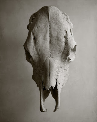
This was my other submission for our Less is More assignment. Again, I was trying to get down to the basic element of my subject...but according to the judges that night this image has too much detail to be Minimalism. I disagree. My searches online showed pretty detailed paintings of graphic lines with color too, so even though the skull has detail I still think this is a minimalistic shot. I tried several versions, using 2 flashes at one time and I ended up using only one SB800 in a softbox on the upper right because I liked the shadow giving the skull form. At first I had the skull sitting directly on the background and played with hard shadows that I really liked but ended up lifting the skull up by balancing it on two clear glasses that could not be seen from above which let some light go through to the far side. The skull is on white posterboard but I added a texture at low opacity in Photoshop.
Below are two more versions I tried with shadows.


I think you made a good choice going with the version you presented. "Minimalistic" or not - it's a great shot. Besides, you've too much "Gold" in your treasurey for April anyway! :)
ReplyDeleteBeautiful shot Cindi!
ReplyDeleteI agree with you that this shot is certainly a good example of minimalism. This was my favorite assignment photo of the night and would have grabbed first place if I were the judge!
Well done!
Barry
I agree with Larry. The one you presented is my favorite. Your post processing of the image took the basic photo to a fine art quality. Really nice work.
ReplyDelete